Semmelweis University
Founded in 1969, Semmelweis University is one of the leading medicine and health science institute in the Central European region.
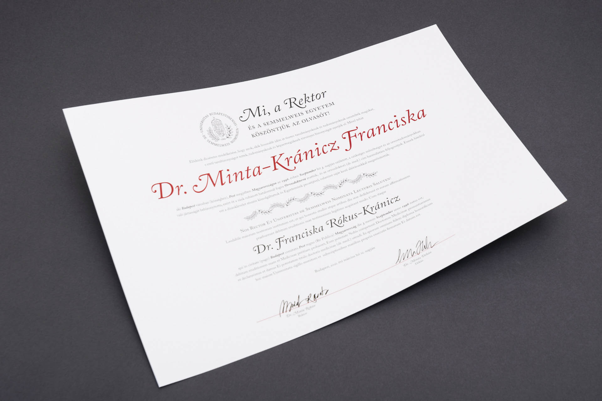
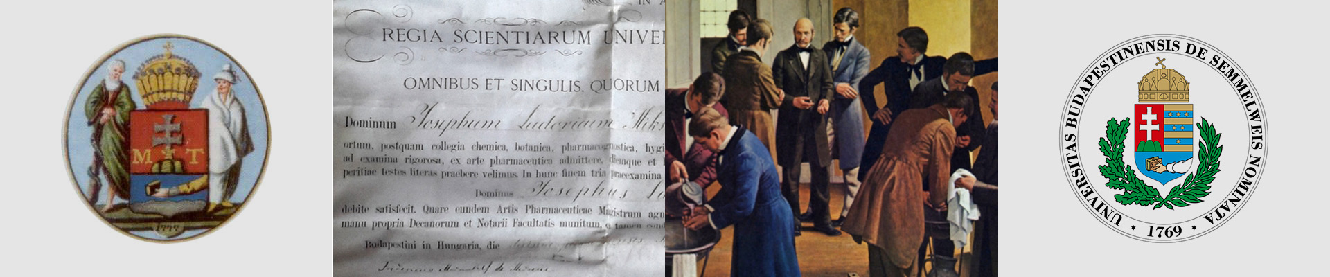
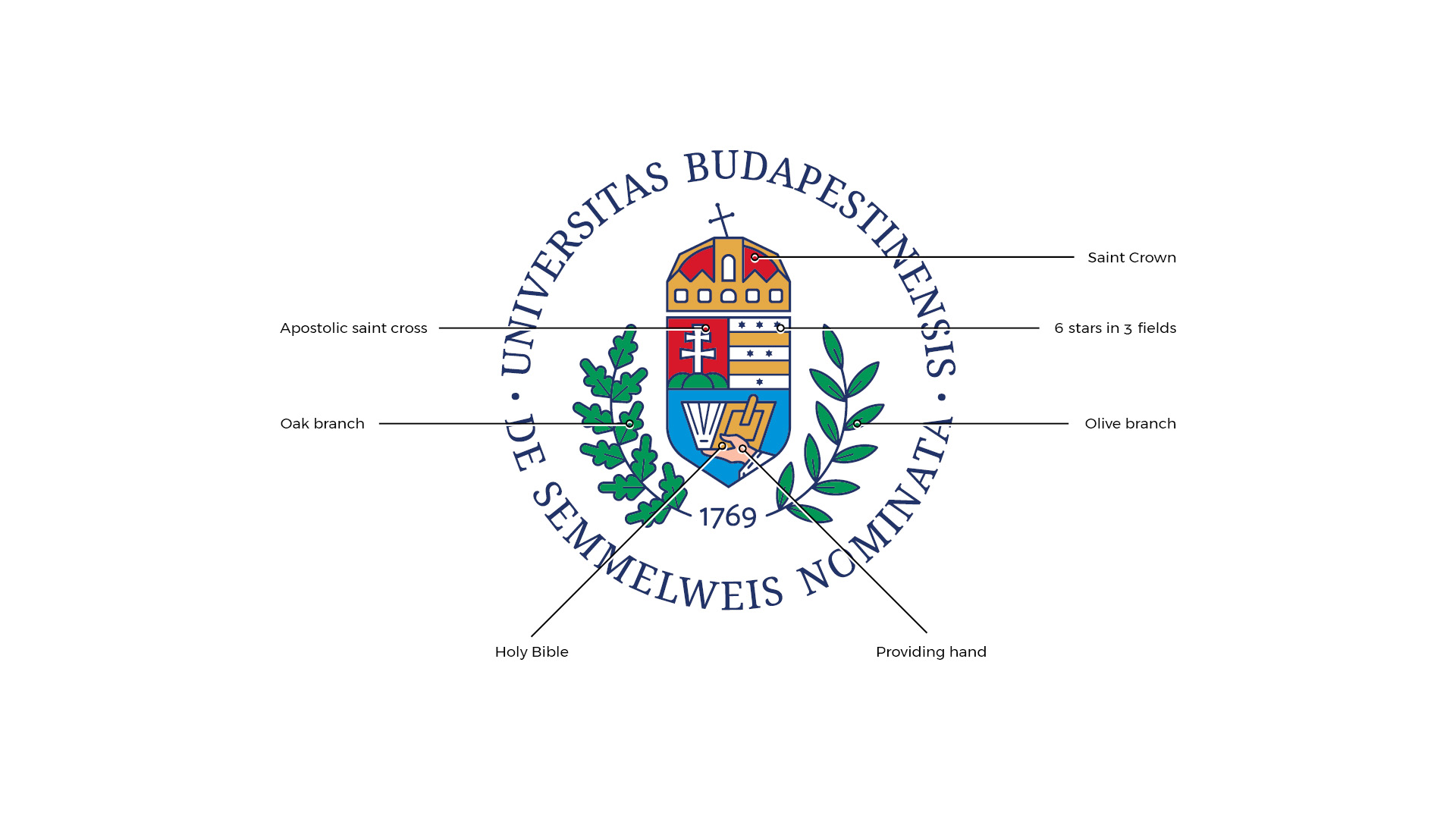
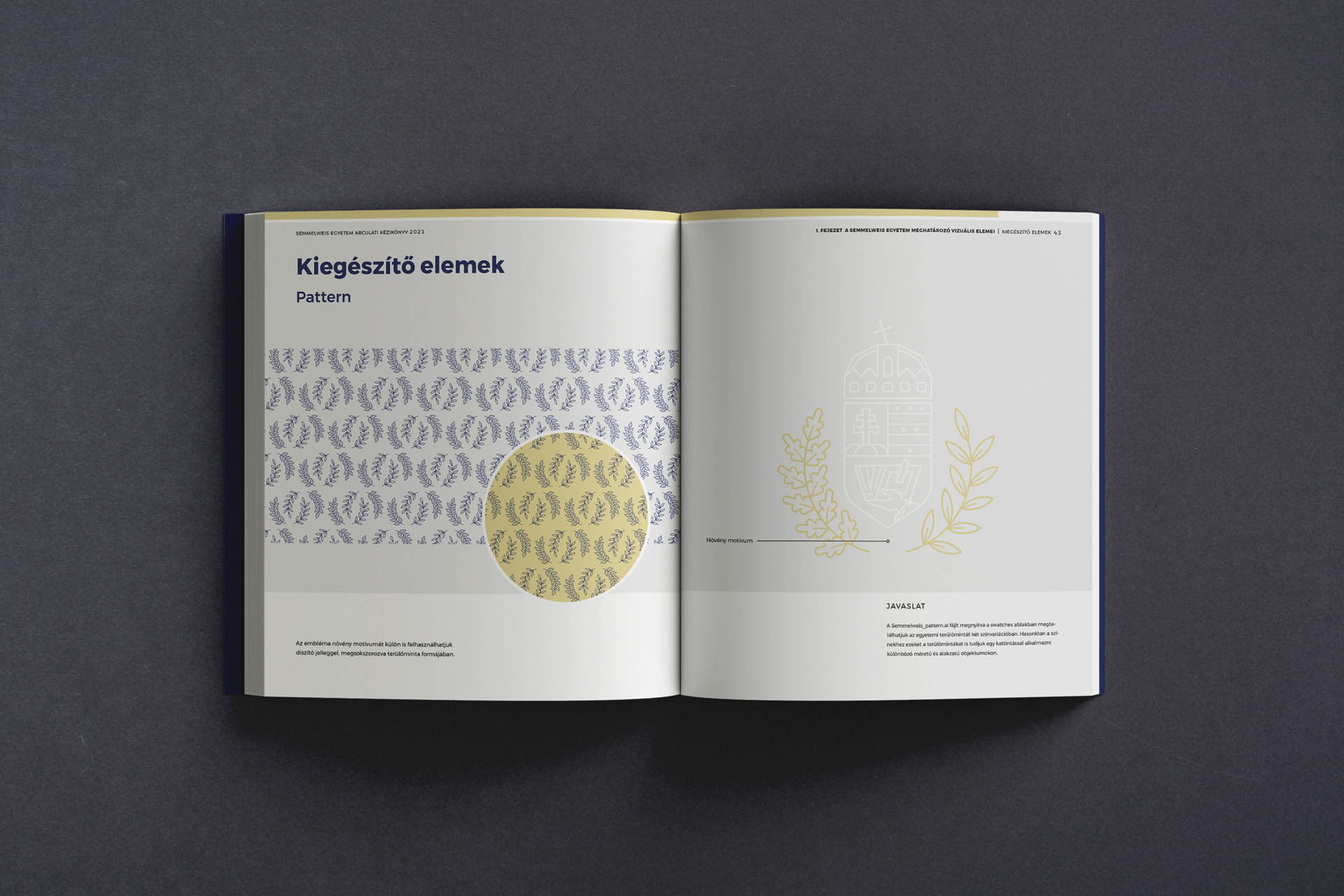
The logo is based on the university's crest, carrying the over 250 years old tradition of the institution. The brief was pretty strict with the elements that could be used in the emblem, but needed a fresh, modern appearance. All the design solutions were made to elevate these elements, and make them suitable for present day usage.
Art Direction: Brand and Marketig Directorate


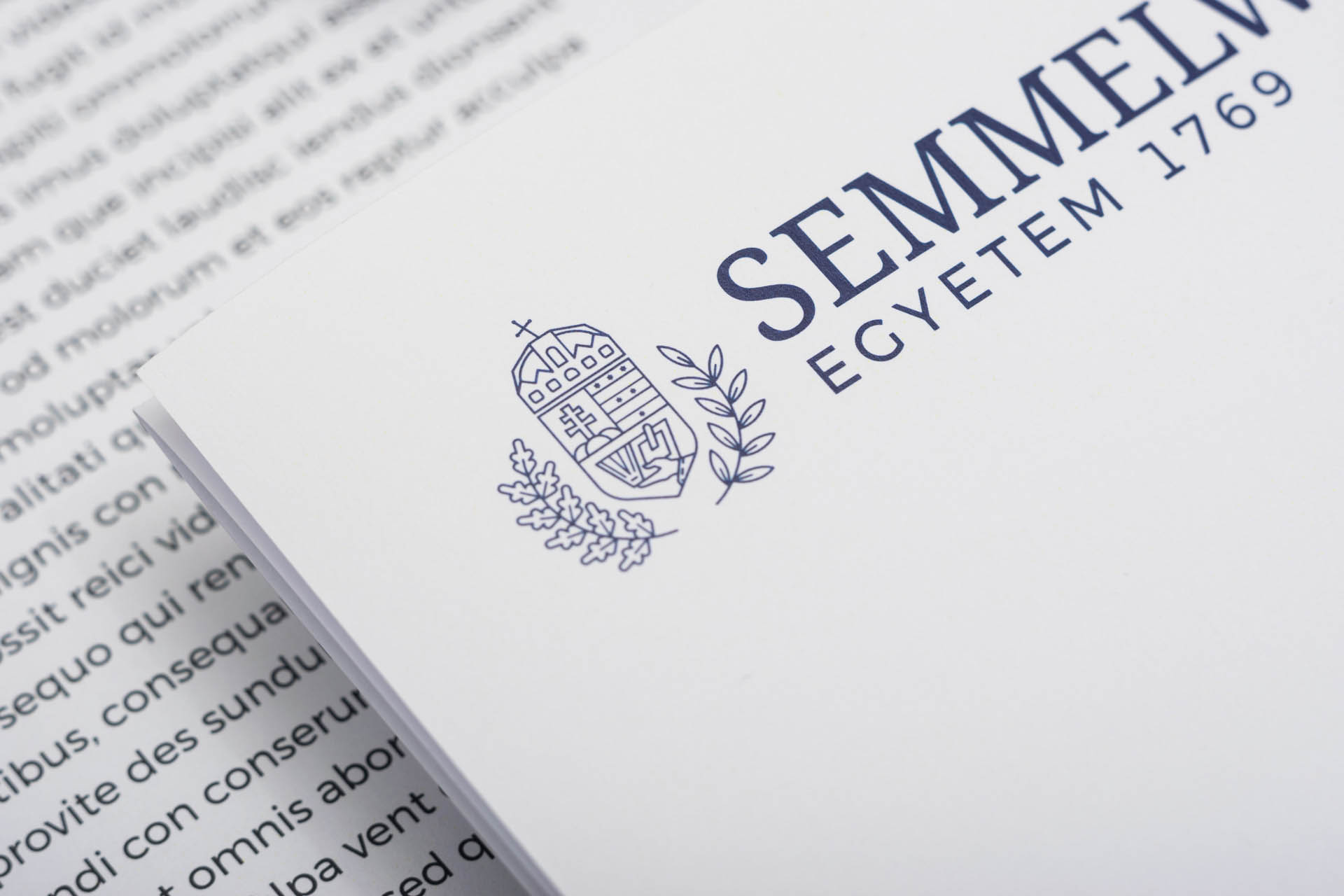
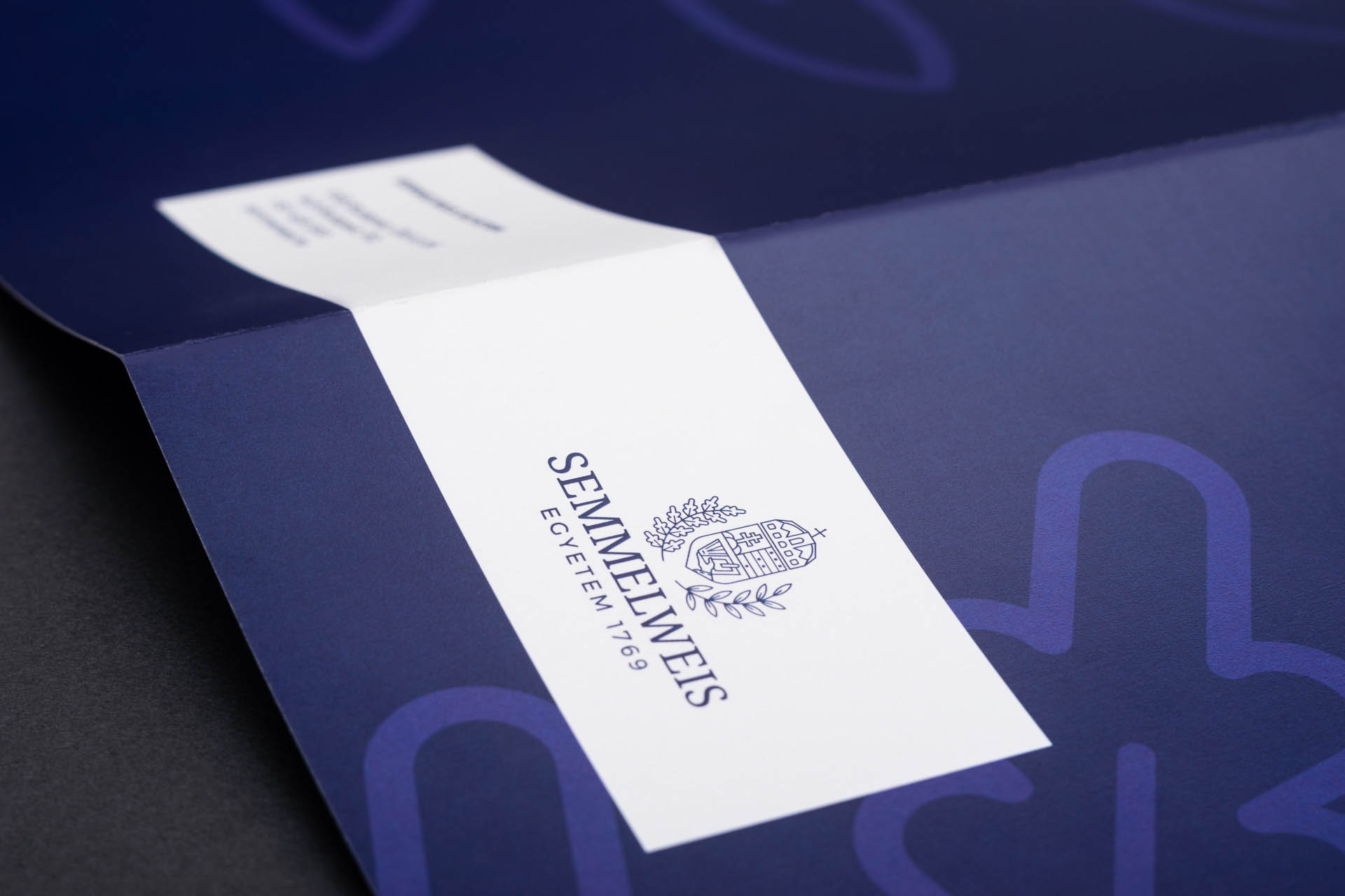
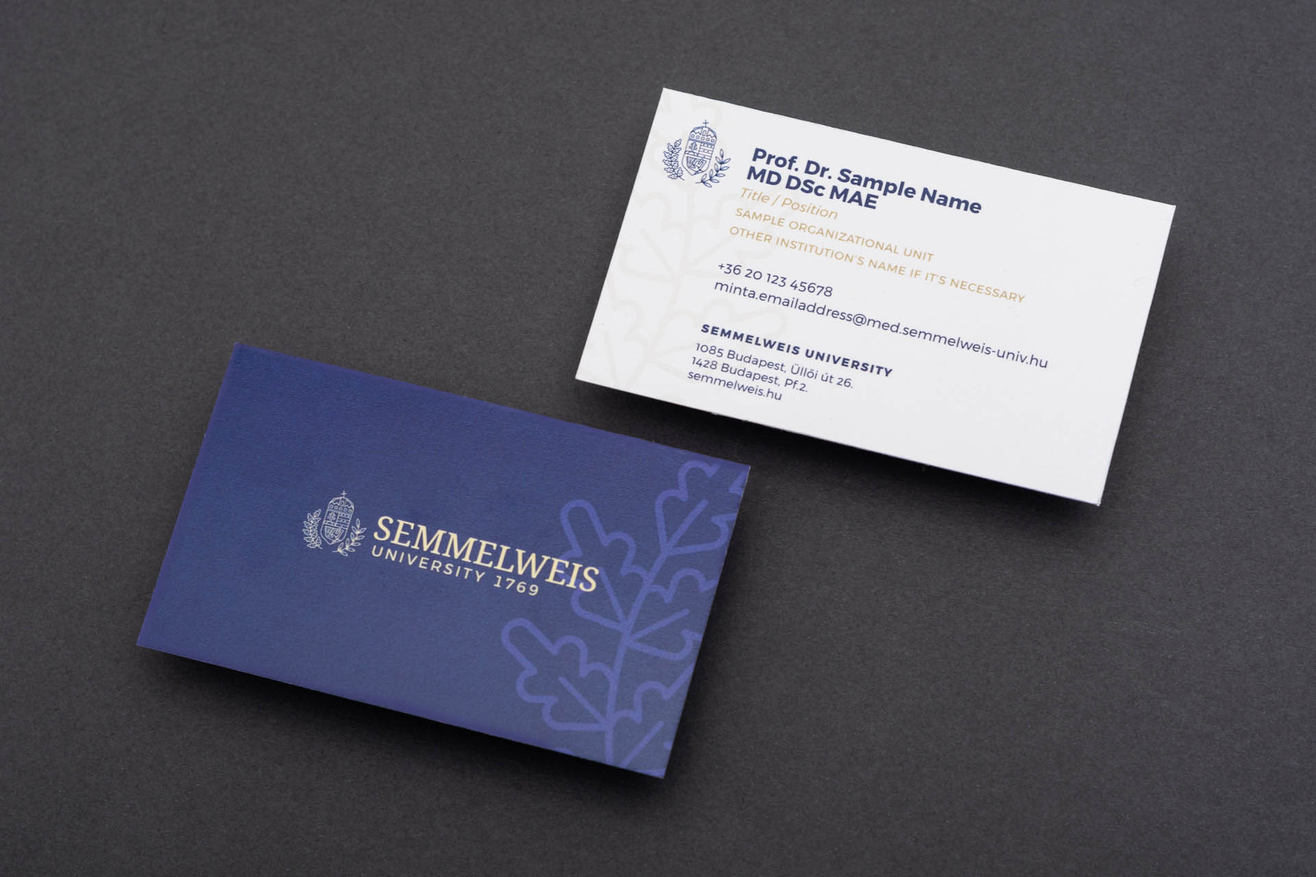
Stationary elements

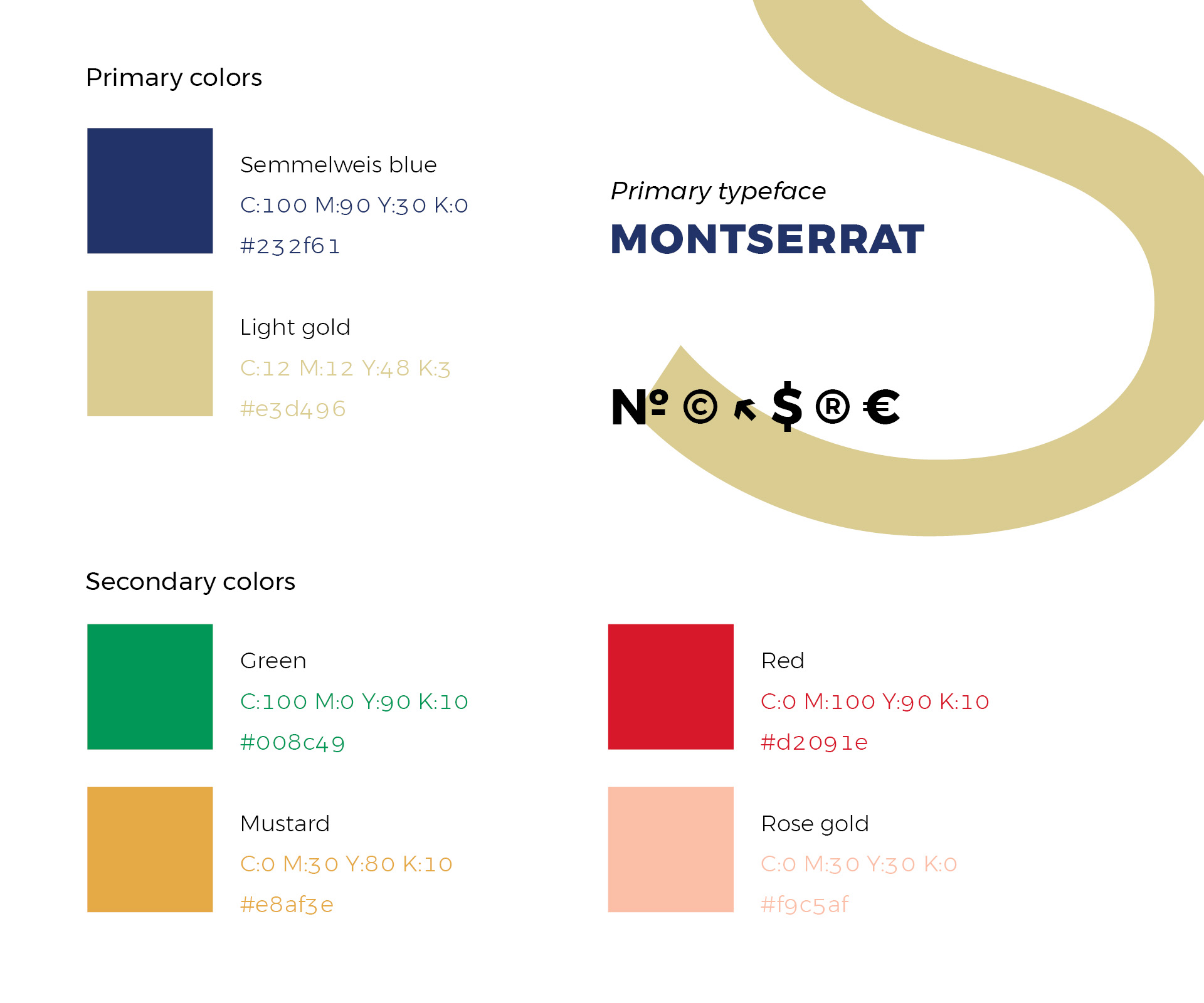
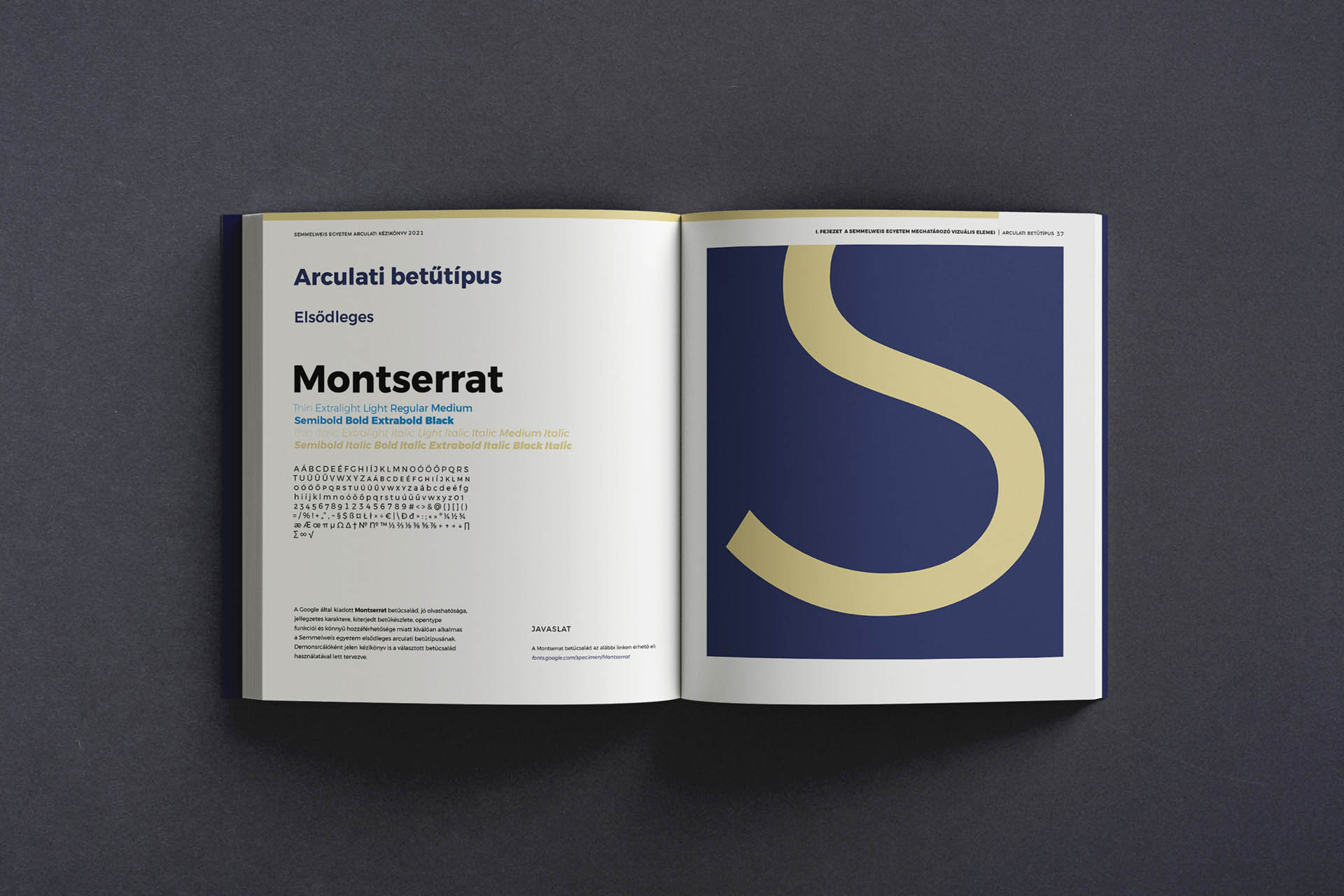
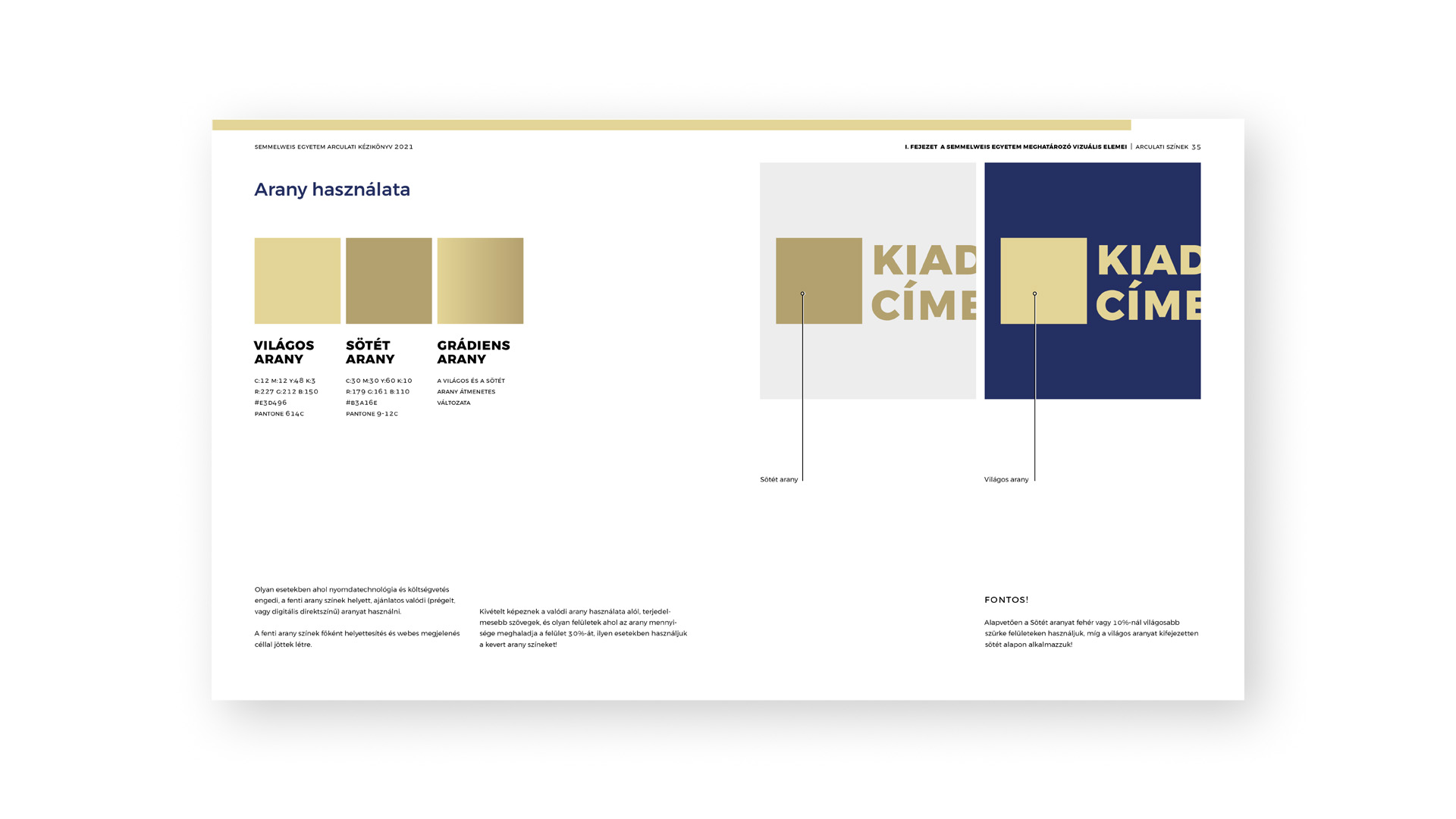
The Brandbook
It's layout is designed so that a spread's ratio is exactly 16:9, but it's size is still economical to print.

The Diploma